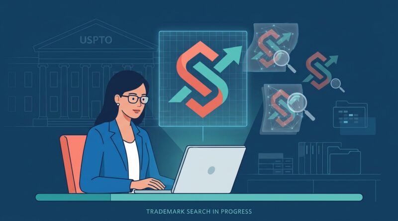
New AI Image Search At The USPTO: How To Stop Look‑Alike Logos From Killing Your Brand Before You File
You can spend weeks picking colors, paying a designer, ordering boxes, setting up ads, and still get blindsided by one ugly trademark problem. Your logo looks fresh to you, but six months later you learn it looks a little too fresh to someone else’s. That is a brutal way to burn cash. The reason this matters right now is simple. The USPTO has signaled in a new federal request for information that it is moving toward an AI-driven image search platform for patent and trademark examination, with demo dates already on the calendar. In plain English, examiners are likely getting much better tools to spot look-alike logos. If your “search” was just Google Images, Canva, or a quick check for similar business names, that is no longer enough. The safer move now is to do a practical visual pre-check before you file, before you print, and definitely before you fall in love with a logo that may not survive review.
⚡ In a Hurry? Key Takeaways
- The USPTO AI image search trademark logo shift means examiners may catch visually similar logos much more easily than before.
- Before filing, check not just names but shapes, layouts, icons, and overall visual feel across your industry.
- A cheap pre-check now can save filing fees, packaging waste, ad spend, and a painful rebrand later.
What the USPTO just signaled, in normal language
The big news is not that a robot will decide your trademark. It is that the USPTO appears to be preparing better image search tools for the people who already examine trademarks and patents.
That matters because logo review has always involved visual judgment. If a design has a similar symbol, arrangement, silhouette, or commercial impression to an existing mark, it can trigger trouble. Smarter image search means more of those close calls may be surfaced faster.
For small businesses, this changes the risk math. A logo that might have escaped notice years ago may be much easier to flag when examiners can search by image patterns instead of relying so heavily on text descriptions and manual review.
Why your usual “trademark search” is probably too weak
Most founders do one of these things:
- Search the brand name on Google
- Look through Canva or Dribbble for similar styles
- Check Instagram handles
- Search the USPTO for the words only
That is better than nothing, but it misses the real problem. Logos are visual. Trademark conflicts often come from the picture, not just the words.
You might choose a different name but still use a near-identical mountain badge, fox head outline, tilted leaf, lightning bolt in a circle, or minimalist letterform. That is where the new direction of USPTO AI image search trademark logo review could sting people who rely on text-only searches.
What AI image search is likely to catch better
Similar shapes and icons
Think apples, shields, crowns, stars, hexagons, animal heads, abstract swooshes, or monograms. Even when line thickness, color, or angle changes, the core symbol can still look too close.
Similar composition
Sometimes the problem is not one icon. It is the whole setup. A circle badge with a pine tree in the middle and curved wording above and below may feel too close to another mark even if each piece is slightly altered.
Similar commercial impression
This is the phrase that trips people up. Trademark law often cares about the overall look and feel. A sleepy moon face in a nursery logo and a different sleepy moon face in another nursery logo can still create confusion if the total impression is close enough.
Industry-specific repetition
Some sectors are full of copycat design habits. Coffee brands love badges. Fitness brands love aggressive animal heads. Skincare brands love minimalist botanical line art. The more crowded the visual lane, the more careful you need to be.
What this means for founders before filing
The filing itself is not the expensive part. The expensive part is everything around it.
Once a logo goes on packaging, labels, signs, social media graphics, paid ads, Amazon listings, and business cards, changing it hurts. If you also bought a domain, took product photos, and built a website around it, a refusal or legal challenge gets very expensive very fast.
So the goal is not just “Can I file?” The goal is “Should I build my brand on this logo at all?”
A practical pre-check you can do now
1. Search the words and the design separately
Start with the brand name in the USPTO database. Then do a second round focused on the logo’s visual elements. If your mark has a wolf, shield, or sunburst, search for those ideas too. You are trying to spot crowded visual territory.
2. Strip away color
Color often distracts people. Convert your logo to black and white and look at the raw shape. Many conflicts become much more obvious once the pretty palette disappears.
3. Shrink it down
Look at it as a tiny social icon or favicon. At small sizes, the broad form matters more than the fine detail. If it still resembles another mark when tiny, that is a warning sign.
4. Check your direct category first
A similar logo in plumbing may not matter much if you sell candles. A similar logo in candles absolutely might. Focus on businesses selling related goods or services.
5. Search image-first, not just word-first
Use image search tools, reverse image tools, marketplace browsing, app stores, and social platforms to spot visual cousins. This is not a legal opinion, but it is a smart early filter.
6. Compare the “skeleton” of the logo
Ignore texture and style. Ask: what is the basic structure? Circle plus animal head. Serif letter inside laurel wreath. Geometric leaf inside droplet. If the skeleton matches another brand in your lane, be careful.
7. Save screenshots of near matches
Make a simple folder with anything that looks close. If you talk to a trademark attorney later, this will save time and help them spot patterns fast.
Red flags that should make you pause
Stop and rethink the logo if you find any of these:
- A very similar icon used for related goods or services
- A near match in silhouette, even if the details differ
- A similar badge or emblem layout in the same market
- A crowded design trend where many brands already look alike
- A logo that depends on a generic symbol with tiny cosmetic changes
If your logo only feels unique when you zoom in, that is not great.
What founders often misunderstand about “confusingly similar”
People assume trademark conflict means exact copy. It does not.
You can have different words and still have a problem. You can change colors and still have a problem. You can redraw the icon yourself and still have a problem. The question is often whether ordinary buyers could think the brands are connected, related, or coming from the same source.
This is also why brand identity is getting more serious across the board. If your business is built around a public persona as much as a logo, you may also want to read New ‘Identity Is IP’ Wave: How To Quietly Trademark Your Online Persona Before AI Platforms And Copycats Do. The bigger theme is the same. Distinct identity matters more when copying gets easier and detection gets smarter.
Should you still use a designer or AI logo maker?
Yes, but with your eyes open.
Good designers can help you avoid generic visual clichés. Bad ones, or rushed marketplace gigs, often remix what already exists. AI logo tools can be even riskier if they steer lots of users toward the same trendy shapes and compositions.
So if you use a designer or generator, ask a blunt question: “How are we checking for visual similarity against existing marks in my category?”
If the answer is basically “We Googled it,” keep pushing.
When it is worth getting legal help
You do not always need a full legal opinion on day one. But it is smart to talk to a trademark attorney when:
- You are about to spend real money on packaging or inventory
- Your logo uses a common symbol in a crowded market
- You found a few close matches and are not sure how risky they are
- You plan to file federally and build the brand long term
That advice can feel expensive until you compare it with the cost of replacing labels, redoing a website, updating seller listings, and explaining a name or logo change to customers.
At a Glance: Comparison
| Feature/Aspect | Details | Verdict |
|---|---|---|
| DIY text-only search | Checks names, misses many visual conflicts in icons, shapes, and layouts. | Too weak on its own |
| Visual pre-check before filing | Looks at image similarity, industry overlap, black-and-white shape, and overall impression. | Strong first step |
| Attorney review for close calls | Helps assess confusion risk before you sink money into branding and product rollout. | Best for serious launches |
Conclusion
The key thing to remember is that this is not a far-off maybe. The USPTO has already signaled through a new federal RFI that it intends to move toward AI-driven image search for examination, with demo dates set, so the way logos are reviewed may change sooner than many small brands expect. As examiners get better tools, look-alike logos that once might have slipped by are more likely to be caught. That makes old-school, text-only DIY searches a risky habit. The good news is you do not need to panic. You just need a better pre-check. Look at the shape, the symbol, the layout, the overall impression, and the marks already living in your category. Do that before you file, before you print, and before you spend heavily on the brand. A little caution now can save a very expensive do-over later.